L
Lt. Smash
Guest
Gents, I've designed a new set of floating icons for CMFI. They are based on symbology the US War Department used in 1943, and before I release them to the general public I want to get your opinion of them, and find a couple of people willing to "test" them for me.
Testing is easy. I'll send you the file. You just install it in the mods directory, please a couple of scenarios and tell me that (a) the icons showed up, (b) the correct icons showed up on the correct units and (c) how you liked them.
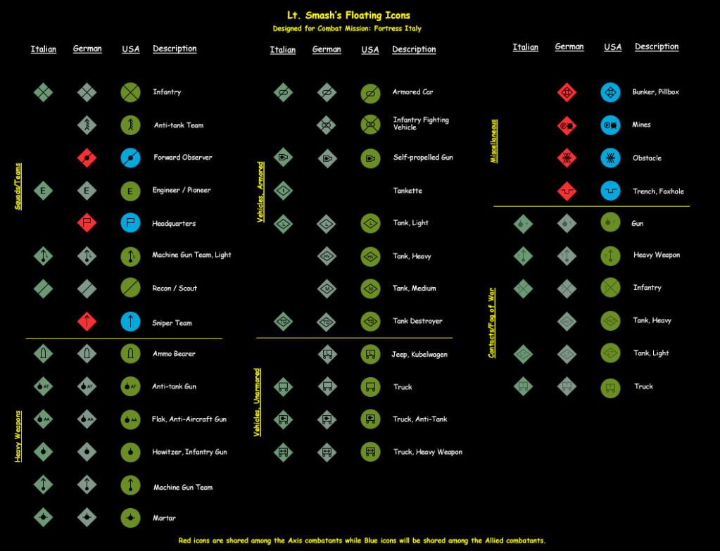
If you don't feel like testing, you can simply look at the graphic below and give me your opinion either in this thread or via PM:
Now that you've seen them, let me say a few words about them and tell you more specifically about the things that have me vexed.
First, my approach is simple: use unique shapes to identify the side, colors to identify the nation and a consistent symbology to ensure that the player can easily recognize a German machine gun versus an Italian machine gun and differentiate between a heavy and a light tank. As you can see, the Axis have diamond icons and the Allies have circular icons. The Germans use Field Grey, the Italians use a green grey, and the Americans use Olive Drab. As mentioned above, the icons are taken from the US War Department's Field Manual FM 21-30 that was issued in July 1943. Some symbols - such as the IFV/Halftrack and Armored Car - are not defined in the field manual , and thus, I had to fudge a little.
Now, there are a couple of things that I'm uncertain about with this icon set and would love your input:
Testing is easy. I'll send you the file. You just install it in the mods directory, please a couple of scenarios and tell me that (a) the icons showed up, (b) the correct icons showed up on the correct units and (c) how you liked them.
If you don't feel like testing, you can simply look at the graphic below and give me your opinion either in this thread or via PM:
Now that you've seen them, let me say a few words about them and tell you more specifically about the things that have me vexed.
First, my approach is simple: use unique shapes to identify the side, colors to identify the nation and a consistent symbology to ensure that the player can easily recognize a German machine gun versus an Italian machine gun and differentiate between a heavy and a light tank. As you can see, the Axis have diamond icons and the Allies have circular icons. The Germans use Field Grey, the Italians use a green grey, and the Americans use Olive Drab. As mentioned above, the icons are taken from the US War Department's Field Manual FM 21-30 that was issued in July 1943. Some symbols - such as the IFV/Halftrack and Armored Car - are not defined in the field manual , and thus, I had to fudge a little.
Now, there are a couple of things that I'm uncertain about with this icon set and would love your input:
- Each side shares a set of icons. These shared icons include HQ units, Forward Observers, Snipers and all fortifications (i.e., wire, trenches, etc.). I've colored these shared icons blue for the Allies and red for the Axis. These colors make these icons stand out and do not make it look like the Germans are leading the Italians (a problem that I have with the US and Commonwealth with CMBN icon set) but are they too much? Should I find a more neutral earth color or just tone down the red and blue?
- The new fog-of-war/contact icons are cool. They let you get an idea of whether or not a contact could be a truck, heavy weapon, tank, etc. But, Battlefront made an odd design decision. They provided a contact icon for a light tank and a heavy tank but no medium/generic tank. I followed this in my design so that the contact icon for a "heavy tank" says "Hv?" However, in playtesting, I'm not sure that this is portraying the right information. For example, it does make the Americans think that any Pz IV could be a Tiger but it also means that any Sherman shows up as a Heavy Tank contact when it isn't. I've considered making the heavy tank contact icon a generic tank. I've also considered making the light tank contact icon a generic tank, too. This would add an additional element of the unknown.


